티스토리 뷰

공의 그라디언트 색을 텍스트에 적용시켜 볼 것이다.
샘플코드
index.html
<!DOCTYPE html>
<html lang="en">

<head>
    <meta charset="UTF-8">
    <meta name="viewport" content="width=device-width, initial-scale=1.0">
    <link rel="stylesheet" href="./sample.css">
    <title>Document</title>
</head>

<body>
    <h1>HELLO, WORLD!</h1>
    <div class="gradcircle"></div>
</body>

</html>
sample.css
body {
    display: flex;
    height: 100vh;
    align-items: center;
    justify-content: center;
    flex-direction: column;
}

h1 {
    font-size: 60px;
}

.gradcircle {
    width: 100px;
    height: 100px;
    border-radius: 5rem;
    background: linear-gradient(to right top, #861657, #ffa69e);
}
우선, gradcircle에 적용된 색을 h1에도 background로 넣어준다.
h1 {
    font-size: 60px;
    background: linear-gradient(to right top, #861657, #ffa69e);
}
그라디언트 내 to right top은 색상을 오른쪽 위를 향해 퍼지도록 한다.

그리고 아래와 같이 적어주자.
h1 {
    font-size: 60px;
    background: linear-gradient(to right top, #861657, #ffa69e);
    color: transparent;
    -webkit-background-clip: text;
}
background-clip은 background 를 어디까지 적용시키는지에 대한 것이다.
우리는 텍스트에 배경색을 채워야 하므로, text를 적어주자.
background-clip만 적으면 텍스트 원래 색인 검은색 배경에 그라디언트가 적용 된다.
이를 보여주게 하려면 텍스트 원래의 색을 투명하게 만들어야 하기 때문에
color: transparent를 적용시킨다.

호환성
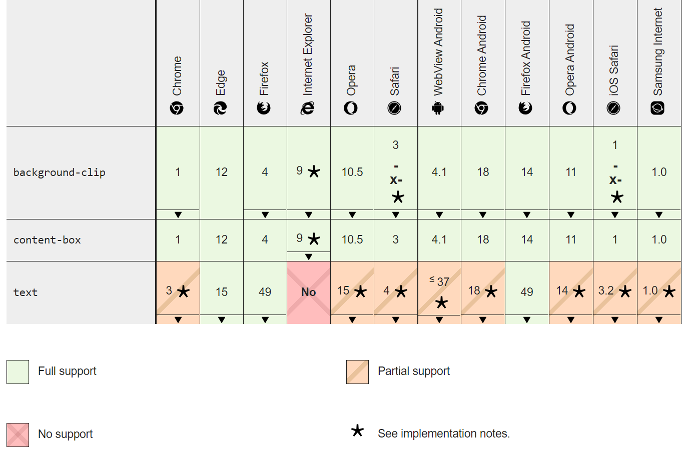
지원의 한계로, 크롬을 위해 앞에 -webkit-을 붙여주었다.
참고:
반응형
'Basic_Studies > CSS' 카테고리의 다른 글
| [CSS] 그라데이션(그라디언트) 줄 있는 것 처럼 보이는 문제 해결 (2) | 2022.07.14 |
|---|---|
| [Tailwind.css] 무한으로 이어지는 슬라이더 구현하기(feat.리액트) (0) | 2021.10.06 |
| [CSS] 마스크 느낌 주기 (0) | 2021.01.18 |
| [CSS] 반응형 단위 정리(vh, em, rem 등) (0) | 2020.08.27 |
| [CSS] 인터넷 브라우저 별 CSS 설정하기 (크롬, 사파리 등) (0) | 2020.08.24 |
댓글
반응형
공지사항
최근에 올라온 글
최근에 달린 댓글
- Total
- Today
- Yesterday
링크
TAG
- vscode venv
- getserversideprops redirect
- 리액트 파라미터 넘기기
- nextjs 파라미터 넘기기
- 움직이는 글래스모피즘
- 리액트 라우터
- 리액트 컴포넌트
- css marquee
- nuxt 공식문서
- 화이팅
- 리액트 스크롤
- NextJS
- 파이썬 flask
- 글래스모피즘 구현
- Til
- css 글래스모피즘
- 백준 10989 파이썬
- bs4 크롤링
- nuxt 공식문서 한글
- 카페음료테스트
- next.js 리다이렉트
- 파이썬 정렬
- dvd 효과
- nextjs 스크롤
- react router
- 글래스모피즘 애니메이션 구현
- 10989 파이썬
- 자바스크립트
- 파이썬 크롤링
- 리액트
| 일 | 월 | 화 | 수 | 목 | 금 | 토 |
|---|---|---|---|---|---|---|
| 1 | 2 | 3 | ||||
| 4 | 5 | 6 | 7 | 8 | 9 | 10 |
| 11 | 12 | 13 | 14 | 15 | 16 | 17 |
| 18 | 19 | 20 | 21 | 22 | 23 | 24 |
| 25 | 26 | 27 | 28 | 29 | 30 | 31 |
글 보관함